Logo Design & Corporate Branding
MAMMACARE, 2015
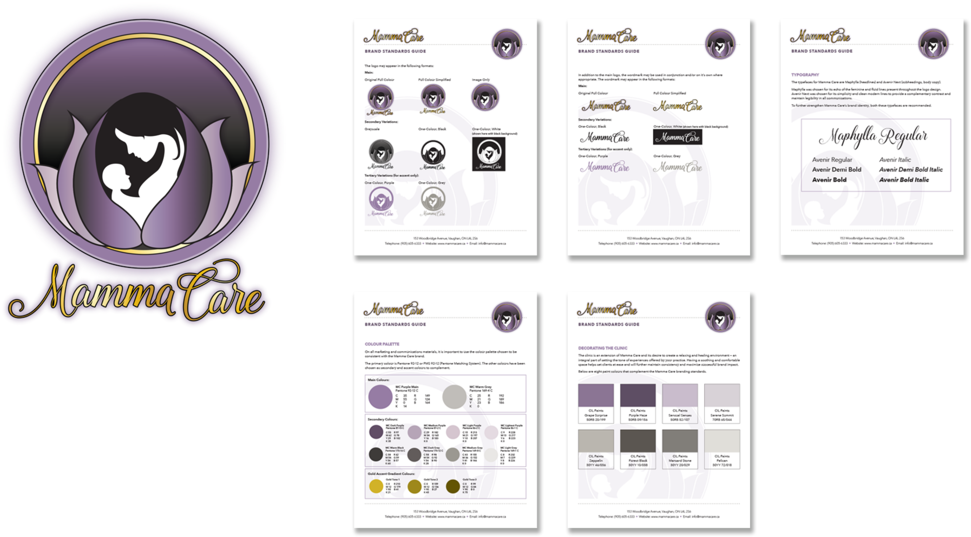
This project involved developing a brand strategy for MammaCare, a health and wellness clinic with a focus on women in all stages of motherhood. The strategy included logo and branding guide detailing: typography, colour palette and coordinating paint swatches.
MammaCare is represented by the development of a soft and feminine yet sophisticated corporate identity. The logo design comprises four basic elements:
- The Circle, and
- The Lotus— Represents life, rebirth, infinity, trust. security, symbolizing the womb. Integrates mother and child into the lotus shape.
- Mother + Child — Uses a “blossoming" effect to mirror the life and birth theme. Strong silhouette of mother and child interconnected in shape. Projecting calm and serene feelings.
- Company Name — Handwritten style, simple and emotive. Trusted, feminine, soothing. Mirrors the swooping lines and circular shapes in the artwork.

